Detailed information about weather and atmospheric chemistry is more accessible than ever before, as illustrated by the Ontario government’s air quality dataset. This open archive assembles ongoing hourly measurements from monitoring stations around the province and beyond. You can plot this data to gain some interesting insights into what is happening in the sky on hourly, daily, seasonal, annual, or even multi-year timescales.
As a demonstration of this capability, consider three of the most commonly measured pollutants: ozone (O3), nitrogen oxides (NOx), and particulate matter with a diameter of less than 2.5µ (PM2.5). Each of these agents qualifies as a pollutant because it is an irritant for the respiratory tract and eyes; they are also chemically linked with one another. Ground-level O3 (not to be confused with stratospheric O3) is created from photochemical reactions involving oxides of nitrogen and volatile organic compounds in sunlight. O3 forms with the help of NO2, which subsequently transforms to nitric acid and toxic organic nitrates, as well as becoming the precursor to nitrates that form respirable particles. We can breathe in those solid particles and liquid droplets that qualify as PM2.5 — including aerosols, smoke, fumes, dust, and pollen — which could ultimately lead to health problems.
Various meteorological factors affect ground-level pollutant concentrations, such as cloudiness or wind speed and direction. However, one of the most significant effects is a stable layer of the atmosphere at and just above ground level. This shallow, stable layer allows local emissions of NO to react with O3, resulting in decreasing O3 concentrations and increasing NO2 concentrations.
Such a stable layer forms readily during a night when skies are clear and winds light or calm, resulting in an effect known as an atmospheric inversion. You can easily compile your own picture of this process, as I have done in Figure 1 with some information from Hamilton.

Figure 1
During the calm morning in this example, increasing emissions of NO reacted with O3 and caused increasing NO2. By afternoon, vertical mixing of the atmosphere diluted NO, and photolysis of NO2 resulted in increasing O3 concentrations.
Compare this urban example with less titration of O3 by NO in a similar plot for a less urban station such as Peterborough, for the same dates and time, as in Figure 2. In these locations, fewer NO emissions result in greater O3 and lower NO2 concentrations.
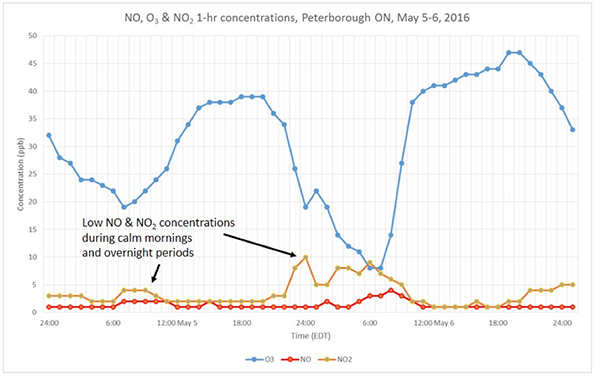
Figure 2
On a seasonal basis, O3 maximum daily concentrations are significantly lower during winter than summer. You can plot the maximum 1-hr O3 concentration for each month and chart the monthly variation, as shown in Figure 3 for London in southwestern Ontario and Sudbury in northern Ontario.
During summer, more hours and intensity of sunshine cause significantly more photolysis that results in higher O3 concentrations than in winter, but other factors include weather patterns with a flow of polluted air containing NOx and volatile organic compound precursors from the southern Great Lakes region into Ontario.

Figure 3
Weather and climate factors cause many other effects as well as year-to-year variations, which become evident when you plot data from another year, as seen in Figure 4.

Figure 4
The pollutant PM2.5 can also be plotted to show how concentrations vary diurnally like NO2, as can be seen in another plot using data from Hamilton

Figure 5
We can plot PM2.5 concentrations and detect effects from wildfires, which are known to be correlated with anomalous increases in concentrations of particulate matter. An example is shown in Figure 6 for North Bay during three months in 2015. The strong concentration spike in early June coincided with a wildfire that caused visible smoke plumes over northern Ontario.

Figure 6
Besides known wildfires, high concentrations of PM2.5 may be caused by other local sources in the same region as the air quality monitor. This can be seen in the chart in Figure 7 for Sudbury for the same date range as the plot in Figure 6.

Figure 7
In addition to the pollutants plotted above, SO2 is also monitored at some locations and a time-series plot may reveal incidences of high concentrations, as in the plot of SO2 at Sudbury, shown in Figure 8, for the same period as the plot of PM2.5 in Figure 7.
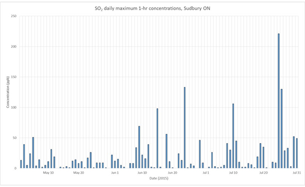
Figure 8
Long-term trends may be found by plotting several years of data, such as the plot of 16 years of annual means of 1-hr NO2 concentrations for Hamilton, shown in Figure 9. Economic factors, improvements in fuel-burning technology, and many other factors besides climate and weather variations affect pollutant concentrations.
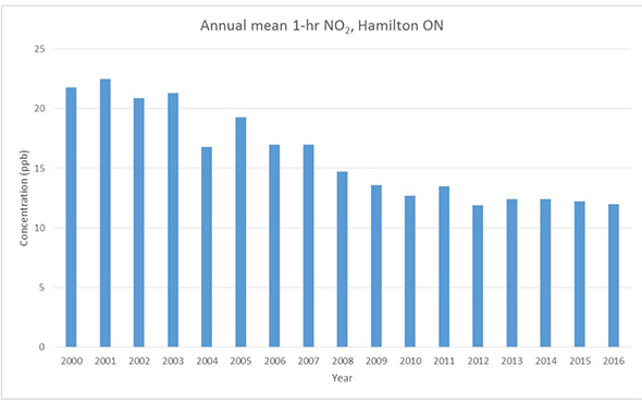
Figure 9
In summary, many interesting patterns in air pollution may be found by plotting and examining openly accessible data. Many more interesting patterns may be revealed by comparing different time periods, different locations, and different pollutants. While pollutant concentrations can be easily accessed for some other provinces, the examples shown above illustrate the diversity of interesting information that may be obtained by simple time-series analysis of the air pollutant data for Ontario.
Frank Dempsey works with the Air Monitoring and Transboundary Air Sciences Section of the Ontario Ministry of Environment and Climate Change.